Model rankings

This is a ranking based off my taste.

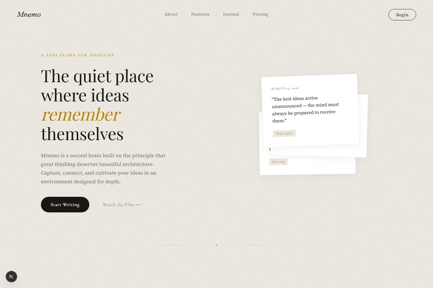
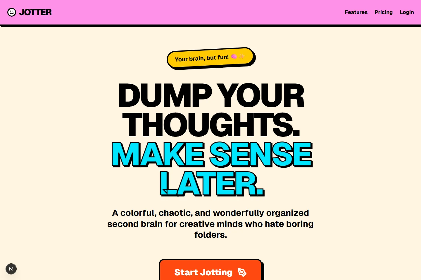
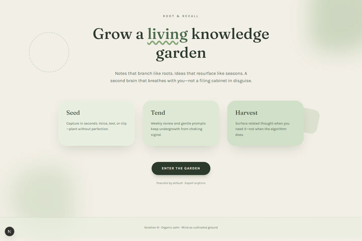
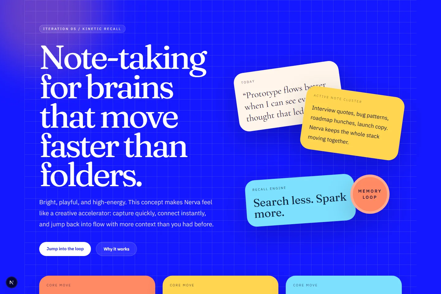
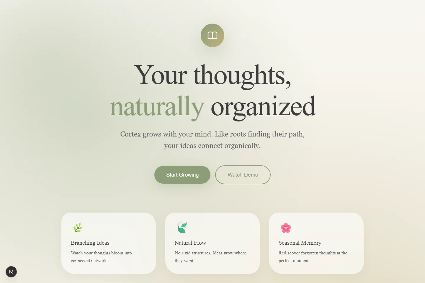
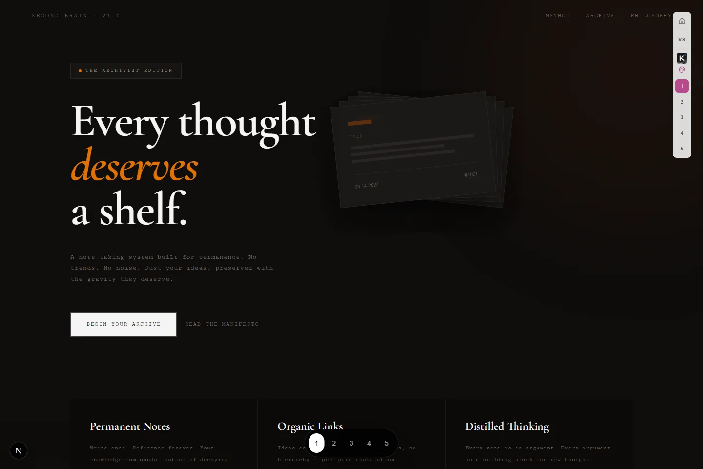
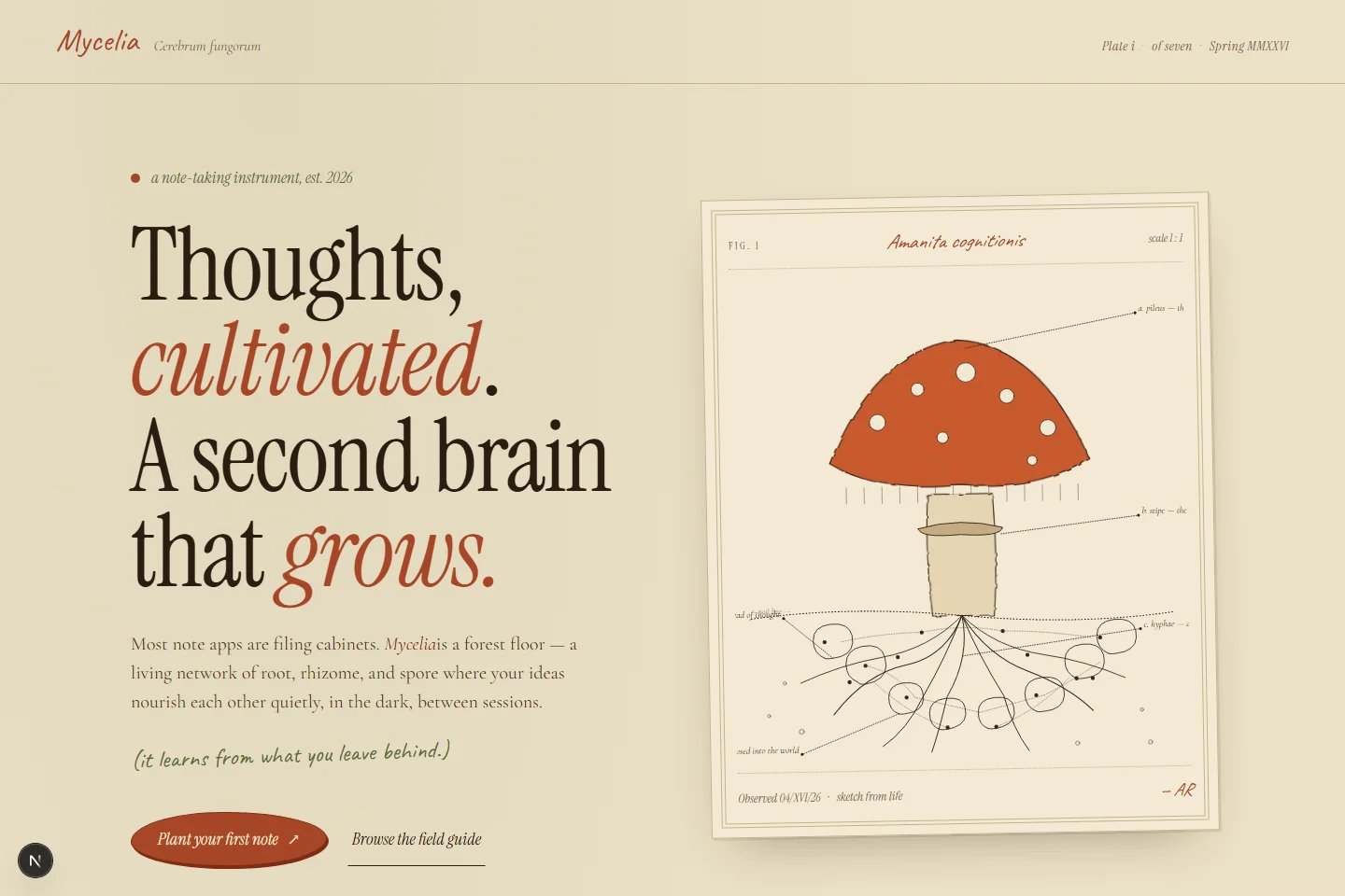
  1. It’s not just “4.6 except the lowest generations got pulled up.” That undersells it. It’s quite a job: not only layout-wise, but how you take all these different things, customize assets, and put them together so they fit the style of what you’re building. I’m noticing a lot of intentional custom assets. Iteration two’s ASCII for each vault name, the type treatment, and the session live section all read deliberate. Page three on iteration three is the one that got me: a full mushroom illustration, and card icons that look like proper SVG marks instead of the random emoji some Opus runs lean on. Field notes in the right font, imagery that fits the site even when it’s a little silly. Iteration five does the same thing, where every illustration feels like someone actually styled this. Down in practice objects and invitation, the one, two, three kanji touches are just beautiful.

  2. Hard to beat on cohesion: it folds the little strengths you see lower in the stack into something cohesive top to bottom. Even iteration one’s terminal concept (not usually my thing) reads tasteful: the refresh animation and how the terminal loads feel intentional. Iteration two’s editorial layout is my favorite, with cards that ease away slightly on hover. Great micro-detail, full-page cohesion, and a first prompt you could plausibly ship. That “first generation is prod-shaped” thing is real; 4.7 just raised the floor on the rest.

  3. What Gemini doesn’t lack is creativity: iterations usually diverge instead of repeating the same layout recipe, and motion is often a strength. Getting it to do exactly what you asked is another story: tooling flakes, outages, brittle instruction-following (that may age fast). In this gallery it’s strong at inventing new directions; next to Claude it falls short for tight, iterative UI polish.

  4. Fast, not expensive, and genuinely good on a lot of fronts. People joke that Composer 2.0 is “Kimi K2.5 part two” because it’s RL’d on Kimi K2.5 (not joking on the lineage), but it’s wrong to treat them as the same model: Cursor put real work in, and the gap in practice (UI included) is big enough that conflating them misses the point. It still has Composer sickness: it does the bare minimum. Landings here tend to be one screen tall (nothing to scroll), because it rarely goes past what you literally asked.

  5. In the beginning there was nothing; then Sam Altman gave us cards. Cards, cards, cards galore: the pattern stack gets played out fast, and the whole thing trends tasteless even when individual choices look “fine.” If you already know exactly what you want, you can steer it; otherwise it’s a lot of default UI noise.

  6. Results are middling: animation is fine, but stacked against GPT‑5.4 at its best I’m not sure it wins on overall polish; it’s close enough to feel like a toss-up, and GPT’s own card habit is partly what keeps the race tight. Again: comparative picks in this bench, not a universal law.

  7. Taste isn’t the main problem; delivery is. You ask for a landing page and get something more like a square with three sentences (minimal to the point of not doing the job), so it loses points on ambition and creative range for the brief.

  8. Bench slot for Kimi K 2.6; update notes after the gallery run is reviewed.